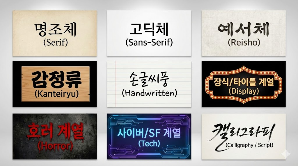
나노바나나에서 사용할 수 있는 한글폰트 스타일
-
나노바나나에서 사용할 수 있는 한글폰트 스타일
"명조체 (Serif)" - 우아하고 끝이 삐친 전통적인 명조 서체
"고딕체 (Sans-Serif)" - 깔끔하고 획이 일정한 현대적인 고딕 서체
"예서체 (Reisho)" - 납작하고 파임이 있는 고전적인 서예 서체
"감정류 (Kanteiryu)" - 굵고 구불구불하며 빈틈이 없는 가부키 스타일 서체
"손글씨풍 (Handwritten)" - 펜이나 마카로 쓴 듯한 자연스러운 필기체
"장식/타이틀 계열 (Display)" - 화려하고 눈에 띄는 디자인의 제목용 서체
"호러 계열 (Horror)" - 피가 흐르거나 거칠고 무서운 느낌의 서체
"사이버/SF 계열 (Tech)" - 디지털, 회로 기판, 또는 픽셀 느낌의 미래적인 서체
"캘리그라피 (Calligraphy / Script)" - 붓으로 멋스럽게 흘려 쓴 예술적인 서체]
aspect_ratio: 1920:1080 prompt: A wide photographic infographic displayed on a gallery wall, showcasing nine distinct typography styles laid out in a 3x3 grid. Each panel contains Korean and English text rendered exactly in the style it describes.
Top row, left: "명조체 (Serif)" rendered in an elegant, traditional serif font resembling printed ink on aged paper. Top row, middle: "고딕체 (Sans-Serif)" in a clean, modern, geometric sans-serif font on a minimalist white background. Top row, right: "예서체 (Reisho)" brushed in ancient Asian calligraphy style with dark ink on textured rice paper.
Middle row, left: "감정류 (Kanteiryu)" in thick, dense, wavy traditional Japanese Kabuki theater style, black ink on a wooden sign. Middle row, center: "손글씨풍 (Handwritten)" written casually with a black marker on a piece of lined notebook paper. Middle row, right: "장식/타이틀 계열 (Display)" as a flashy, decorative, illuminated marquee sign with bulb lights.
Bottom row, left: "호러 계열 (Horror)" in jagged, dripping blood-red letters on a dark, scratched, grungy background. Bottom row, middle: "사이버/SF 계열 (Tech)" made of glowing blue and purple digital circuit patterns on a futuristic interface screen. Bottom row, right: "캘리그라피 (Calligraphy / Script)" flowing beautifully in expressive, swooshing black ink brushstrokes on high-quality art paper.
The overall style is clean and curated, emphasizing the textural differences of each font style.
1
온라인9
사용자6.8k
토픽6.9k
게시물

-
나노바나나에서 사용할 수 있는 한글폰트 스타일
"명조체 (Serif)" - 우아하고 끝이 삐친 전통적인 명조 서체
"고딕체 (Sans-Serif)" - 깔끔하고 획이 일정한 현대적인 고딕 서체
"예서체 (Reisho)" - 납작하고 파임이 있는 고전적인 서예 서체
"감정류 (Kanteiryu)" - 굵고 구불구불하며 빈틈이 없는 가부키 스타일 서체
"손글씨풍 (Handwritten)" - 펜이나 마카로 쓴 듯한 자연스러운 필기체
"장식/타이틀 계열 (Display)" - 화려하고 눈에 띄는 디자인의 제목용 서체
"호러 계열 (Horror)" - 피가 흐르거나 거칠고 무서운 느낌의 서체
"사이버/SF 계열 (Tech)" - 디지털, 회로 기판, 또는 픽셀 느낌의 미래적인 서체
"캘리그라피 (Calligraphy / Script)" - 붓으로 멋스럽게 흘려 쓴 예술적인 서체]
aspect_ratio: 1920:1080 prompt: A wide photographic infographic displayed on a gallery wall, showcasing nine distinct typography styles laid out in a 3x3 grid. Each panel contains Korean and English text rendered exactly in the style it describes.
Top row, left: "명조체 (Serif)" rendered in an elegant, traditional serif font resembling printed ink on aged paper. Top row, middle: "고딕체 (Sans-Serif)" in a clean, modern, geometric sans-serif font on a minimalist white background. Top row, right: "예서체 (Reisho)" brushed in ancient Asian calligraphy style with dark ink on textured rice paper.
Middle row, left: "감정류 (Kanteiryu)" in thick, dense, wavy traditional Japanese Kabuki theater style, black ink on a wooden sign. Middle row, center: "손글씨풍 (Handwritten)" written casually with a black marker on a piece of lined notebook paper. Middle row, right: "장식/타이틀 계열 (Display)" as a flashy, decorative, illuminated marquee sign with bulb lights.
Bottom row, left: "호러 계열 (Horror)" in jagged, dripping blood-red letters on a dark, scratched, grungy background. Bottom row, middle: "사이버/SF 계열 (Tech)" made of glowing blue and purple digital circuit patterns on a futuristic interface screen. Bottom row, right: "캘리그라피 (Calligraphy / Script)" flowing beautifully in expressive, swooshing black ink brushstrokes on high-quality art paper.
The overall style is clean and curated, emphasizing the textural differences of each font style.
-
나노바나나로 보다 그럴듯하게 만드는 방법은 실제를 만들고 나머지를 바꿔달라고 하면 됨
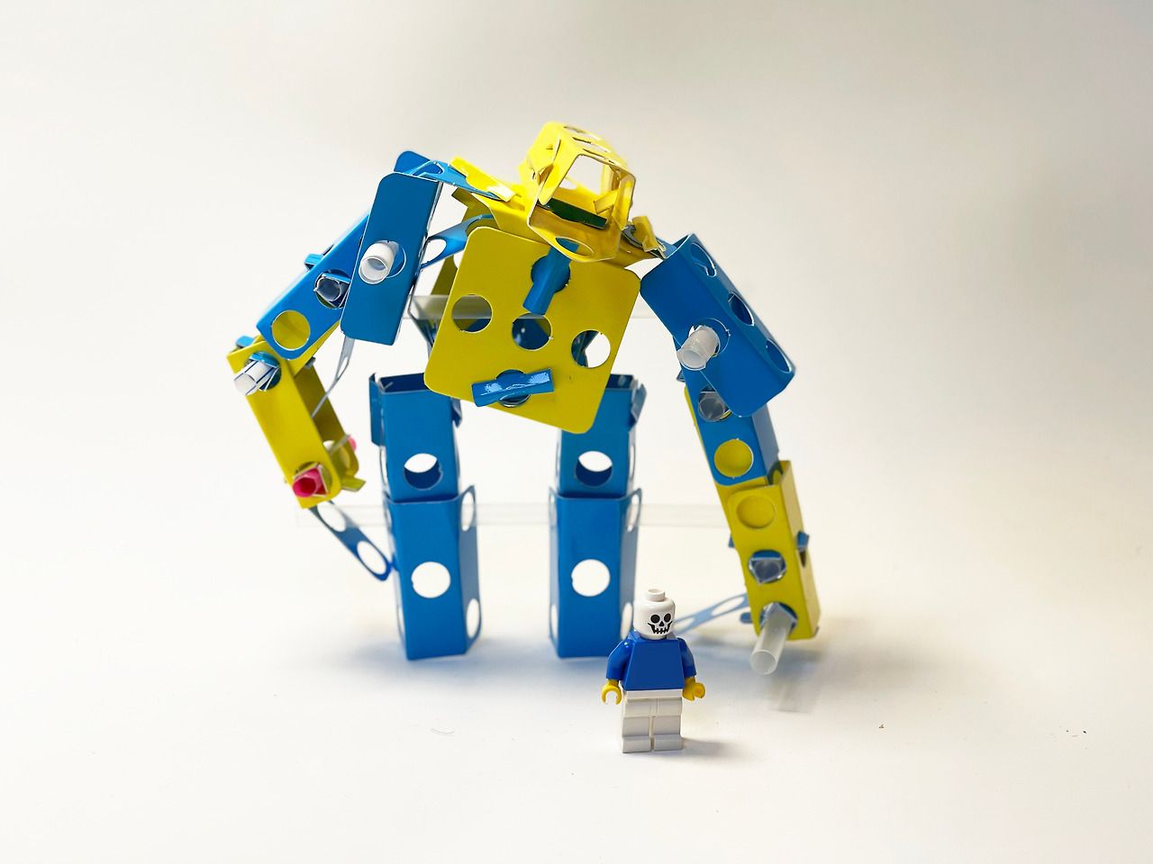
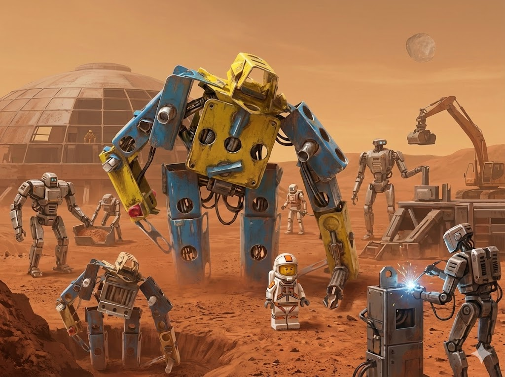
22세기 메탈릭 로봇 작업장비로 화성에서 건축을 하는 작업중인 수 많은 장비들이 함께 일하고 있는 모습 미니피규어를 우주복으로 변경하고 90년대 SF포스트 스타일로 작업
그리고 다른 각도로 촬영한 연출을 veo3로 작업하면 짧은 영상을 작업이
-
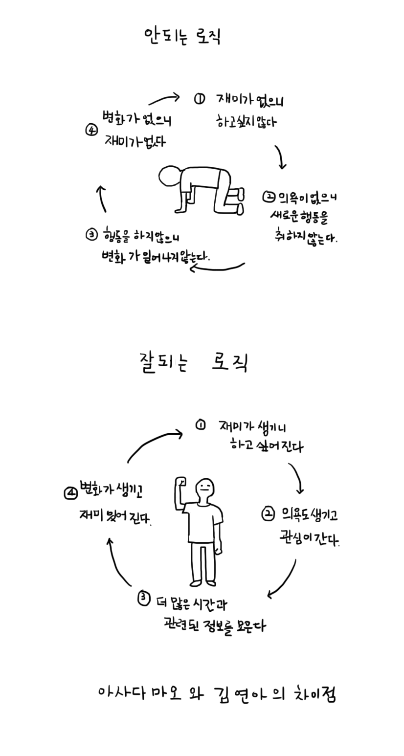
재미경제학 - 안되는 로직, 잘되는 로직

재미경제학 - 안되는 로직, 잘되는 로직
이론적 배경: 재미의 경제학적 순환이 인포그래픽은 '재미'를 핵심 자원으로 보는 '재미경제학'의 관점에서 성공과 실패의 메커니즘을 설명합니다. 재미는 단순한 감정이 아니라, 행동을 유발하고 지속시키는 강력한 동기 부여 요소로 작용합니다.
안되는 로직 (The Vicious Cycle of Failure)
실패의 악순환은 '재미의 부재'에서 시작됩니다.재미가 없으니 하고 싶지 않다.
(초기 동기 부족)
의욕이 없으니 새로운 행동을 취하지 않는다.
(행동의 부재)
행동을 하지 않으니 변화가 일어나지 않는다.
(결과의 정체)
변화가 없으니 재미가 없다.
(악순환의 완성)
결론: 재미가 없으면 의욕과 행동이 사라지고, 결국 아무런 변화도 일어나지 않는 침체 상태에 빠지게 됩니다.
잘되는 로직 (The Virtuous Cycle of Success)
성공의 선순환은 '재미의 발견'에서 시작됩니다.재미가 생기니 하고 싶어진다.
(강력한 내적 동기 부여)
의욕도 생기고 관심이 간다.
(자발적 참여와 몰입)
더 많은 시간과 관련된 정보를 모은다.
(적극적인 투자와 학습)
변화가 생기고 재미있어진다.
(성취감과 긍정적 강화)
결론: 재미를 느끼면 자발적인 의욕과 노력이 뒤따르며, 이는 실질적인 변화와 성장을 만들어내어 더 큰 재미를 느끼게 하는 성공의 선순환을 만듭니다.
핵심 요약: 결국, **'재미 자체'**가 성공과 실패를 가르는 가장 근본적인 원동력입니다.
원본
-

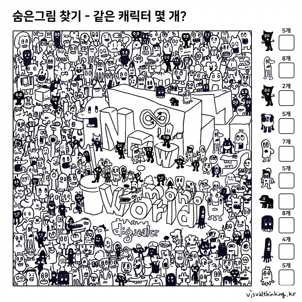
제가 그린 오래된 그림을 페이스북 페이지에 그려놨던 기억이 나서 모두 퍼즐로 만들어보고 있습니다.
캐럭터를 가득채워서 동일한 캐릭터를 찾는 숨은그림 찾기 9개의 캐릭터를 우측에 세로줄로 캐릭터가 나오고 같은 캐릭터의 숫자가 적을 수 있는 공간과 작은 숫자 갯수를 만들어 아이들 학습용
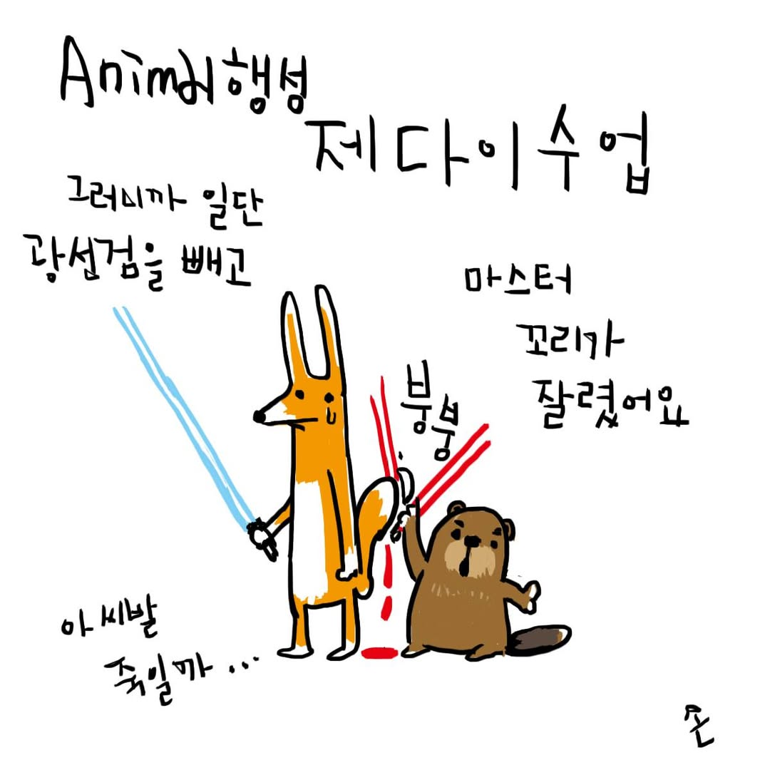
손으로 그린 그림에 수업 2 를 만들어 달라고 했습니다.
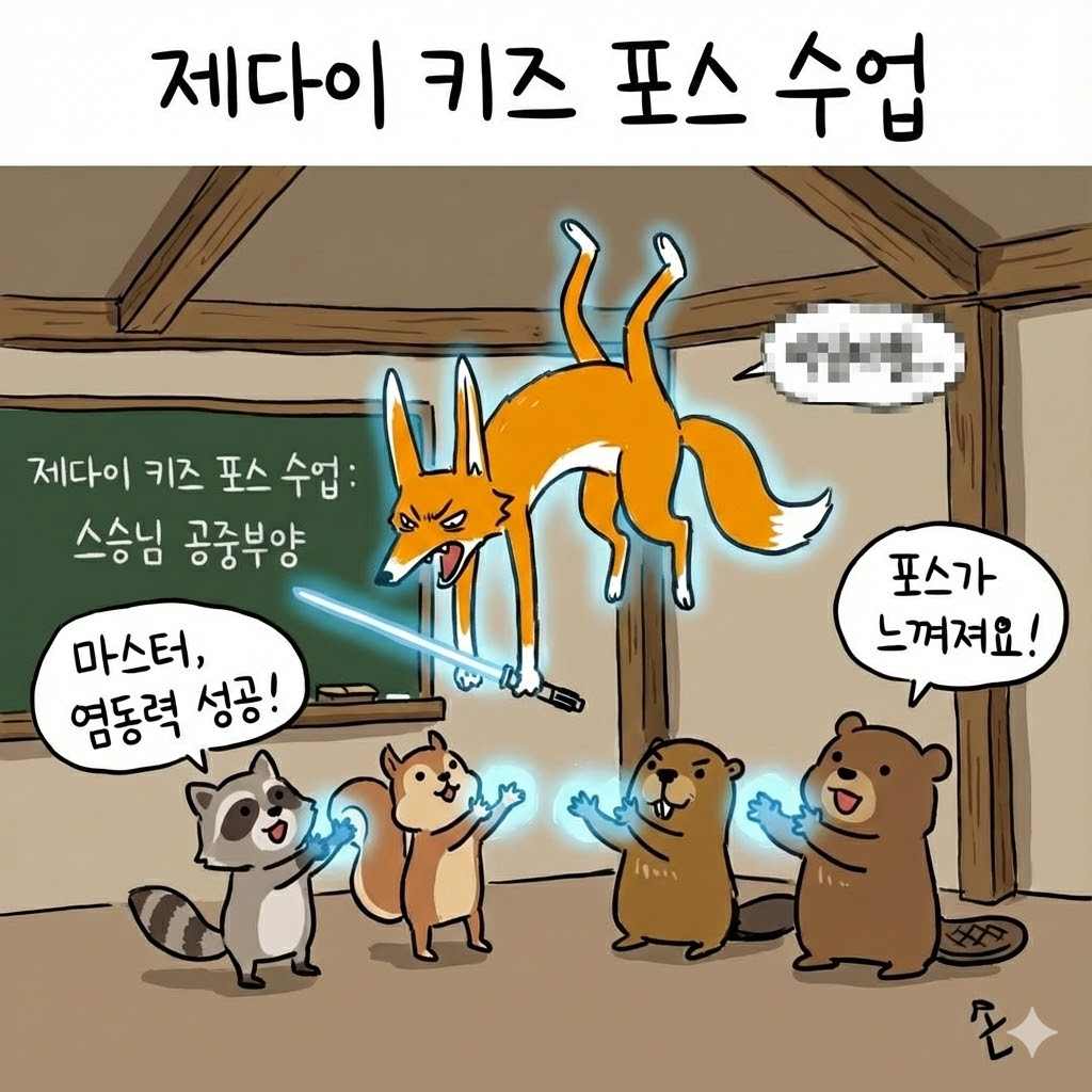
모자이크로 푸념은 지우고
만화가들에게는 이제 상상력만 필요합니다. 다만 그림체를 유지하는 것은 조금 어려워 보여요 아마 학습이 덜된것 때문이겠죠?